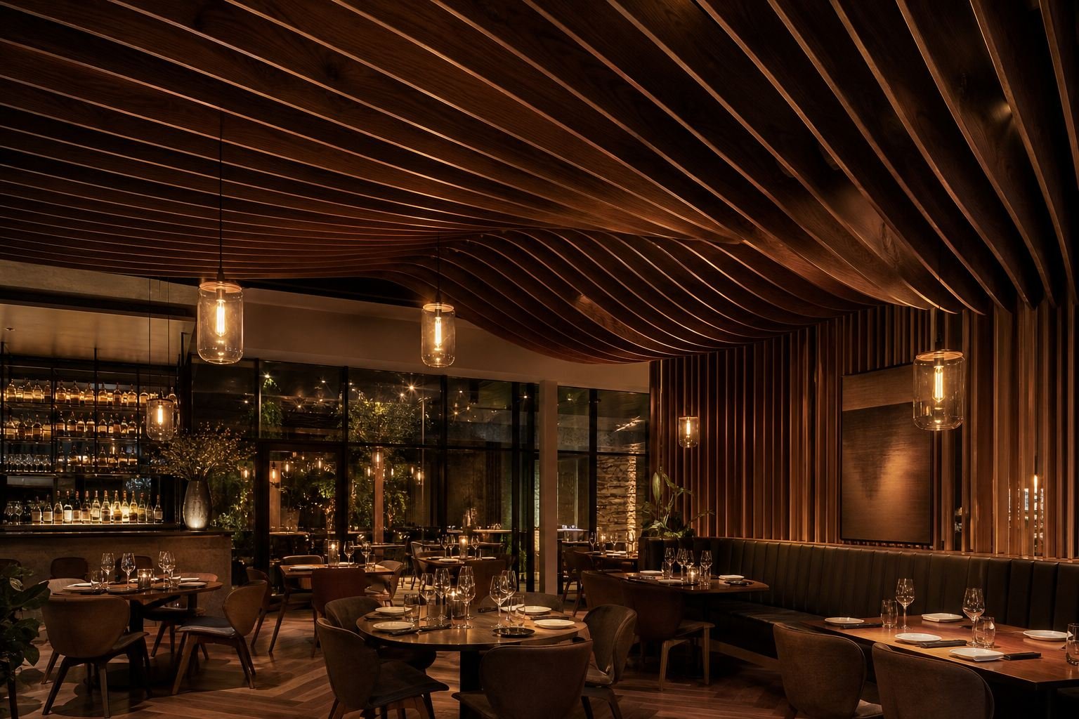
For decades, "coloured wood" meant one of two compromises: paint that hides the grain, or laminate that imitates it. In the last few years a third option has moved from niche to specification default in luxury hospitality — and it changes how colour behaves in an interior.
The problem with colour on the surface
Paint and PU-coated MDF deliver perfectly even colour, and that’s exactly the problem — evenness reads as plastic. The first chip at a skirting or door edge exposes brown substrate under the colour, and site touch-ups never quite match. Laminates fare better on durability but bring their own tells: printed repeats, hollow acoustics, and edges that eventually lift.
Interior designers kept asking the same question: can we have real wood, but in our colour?
What through-dyeing actually does
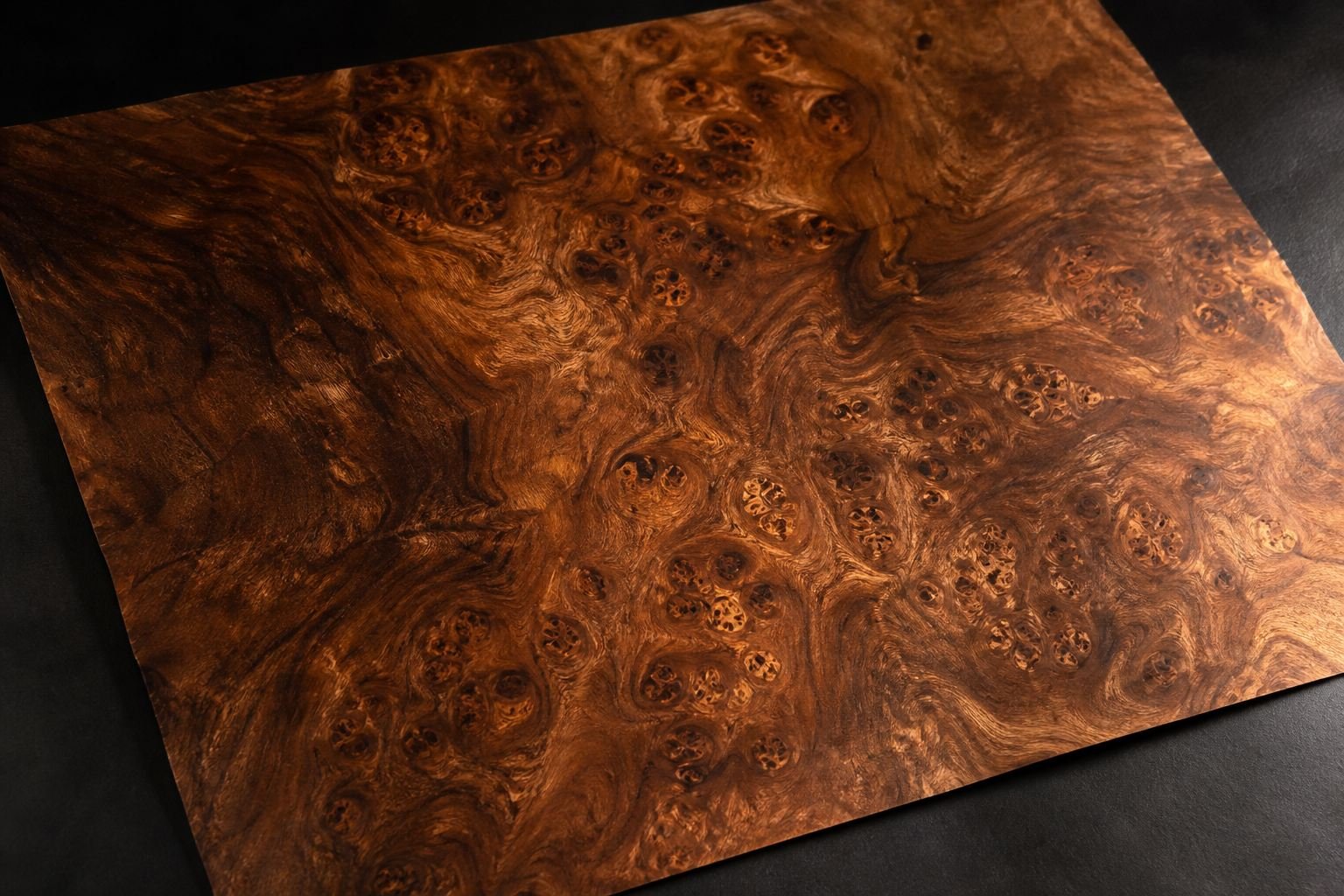
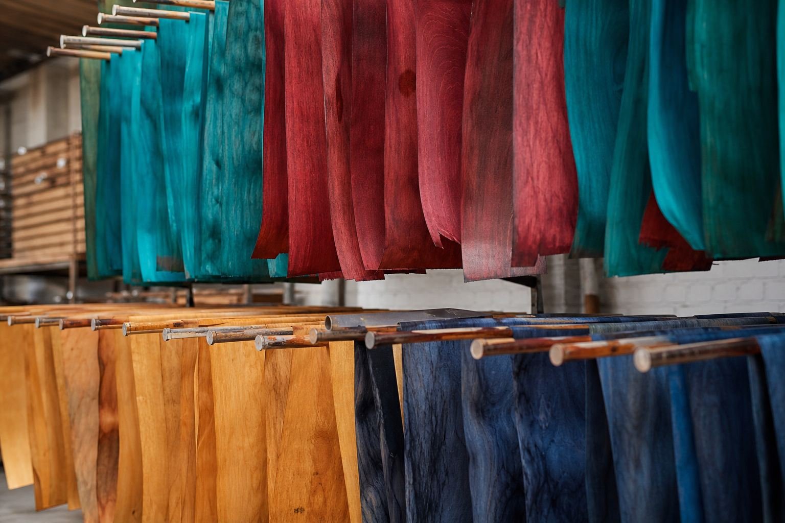
Through-dyed veneer starts as a natural leaf — real oak, ash or sycamore — placed in an autoclave where water-based dye is driven through the full 0.55 mm thickness under pressure. The pigment is transparent, so everything that makes the species recognisable stays visible under the colour: medullary rays, flecks, cathedral crowns.
“The colour lives inside the wood. Sand it, profile it, edge-band it — the tone never breaks.”
— Production note, Milair dye house
The practical consequences are what won specifiers over:
- Edges machine clean — no substrate flash at profiles or chamfers
- Repairs blend, because the colour is not a film that can chip
- UV-inhibitor infusion keeps tones stable in daylight-heavy spaces
- Every sheet is still unique — colour with none of the print repeat
Where it’s showing up
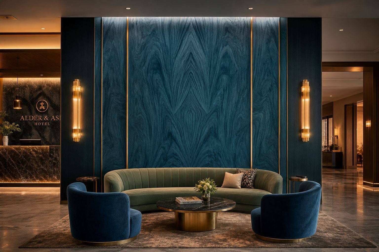
Hospitality led the shift — reception feature walls and lift lobbies where colour has to carry brand identity without feeling synthetic. Residential followed with wardrobe fronts and vanity units, and the newest wave is retail: counters and wall fixtures in saturated, grain-visible tones that photograph like furniture rather than shopfitting.
The specification pattern is consistent: a dyed feature surface framed by natural-toned veneer or stone, with brass or blackened-steel trims. Colour becomes the room’s protagonist precisely because it still reads as wood.
Specifying it well
Three practical notes from our project files. First, order the full quantity in one dye lot — batch matching holds ΔE < 1.0 within a lot, and mixing lots on one wall is the most common avoidable error. Second, keep the clear coat at 30 gloss or below; higher sheens flatten the figure the dye was chosen to preserve. Third, request sequence-matched bundles for walls over four metres — continuity of grain matters more, not less, when colour is involved.
Colour trends will rotate — this year’s teal is next year’s oxblood. What has permanently changed is the expectation underneath: when a designer asks for coloured wood now, they mean wood that is actually, entirely, that colour.